
Gotham is a widely used typeface known for its modern and clean design. It was designed by American type designer Tobias Frere-Jones in collaboration with Jonathan Hoefler. Gotham has gained popularity for its versatility and is commonly used in various graphic design, print, and digital projects. Here’s everything you need to know about Gotham Font.
What Is Gotham Font?
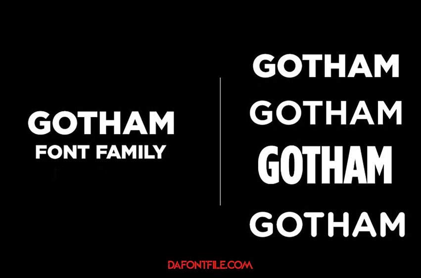
Gotham font is a geometric sans-serif typeface family designed by Tobias Frere-Jones with Jesse Ragan and released in 2000. Inspired by the bold architectural lettering of mid-twentieth-century New York City, it has become a widely popular choice for designers, branding, and even websites.
Here’s what makes Gotham stand out:
Versatile Family: It isn’t just one font! Gotham comes in four widths (Narrow, Extra Narrow, Condensed, Regular) and eight weights (Thin to Ultra), offering a plethora of options for headlines, body text, labels, and more.
Distinct Personality: Its clean lines, open forms, and sturdy structure convey a sense of modernity, professionalism, and confidence.
Wide Applications: From financial institutions and tech companies to universities and fashion brands, Gotham’s versatility translates well across various industries.
Notable Appearances: It has graced the websites of Twitter and Vimeo, the branding of Uber and Spotify, and even the signage of New York University.
Beyond the Cityscape: While inspired by New York, Gotham’s appeal extends far beyond its namesake. Its clean aesthetic and diverse family make it a reliable choice for various design projects.
However, remember:
- Licensing: If you plan to use Gotham in your work, consider purchasing a license as it’s not a free font.
- Accessibility: While generally readable, some weights and widths might require specific attention to ensure accessibility for all users.
How To Use Gotham Font?
Using Gotham font effectively requires considering various aspects, from choosing the right variation to ensuring accessibility and branding consistency. Here’s a guide to help you navigate its usage:
1. Select the Right Variation:
- Width: Gotham comes in Narrow, Extra Narrow, Condensed, and Regular widths. Consider the space available and desired impact. Narrow fonts suit tight constraints, while Regular offers classic proportions.
- Weight: Available from Thin to Ultra, choose appropriate weight for its purpose. Headlines benefit from bolder weights, while body text requires lighter weights for optimal readability.
2. Consider Accessibility:
- Contrast: Ensure sufficient contrast between font color and background. Lighter weights on light backgrounds or vice versa can hinder readability, especially for users with visual impairments.
- Font Size: Maintain appropriate font size based on context. Aim for at least 14pt for body text and adjust for smaller screens or complex layouts.
- Line Spacing: Use adequate line spacing between text lines to enhance readability and avoid cramped appearance.
3. Maintain Branding Consistency:
- License: As Gotham is commercially licensed, ensure you have the appropriate license for your intended use.
- Consistency: If using Gotham as part of your brand identity, stick to specific variations and weights consistently across all communication materials. This reinforces brand recognition and professionalism.
4. Think Beyond Aesthetics:
- Tone: Gotham’s clean lines convey modernity and confidence. However, remember the overall message and audience. It might not be the best choice for a warm, playful, or handwritten aesthetic.
- Hierarchy: Utilize different weights and sizes to create visual hierarchy, guiding the reader’s eye to important information. For example, use bolder weights for headlines and lighter weights for body text.
Additional Tips:
- Experiment: Explore different combinations of width, weight, and color to find the perfect match for your project.
- Seek Inspiration: Look at how other brands and designers use Gotham for inspiration and avoid direct copying.
- Test Thoroughly: Always test your chosen font combinations on various screen sizes and devices to ensure optimal readability and user experience.
By following these guidelines and considering your specific design goals, you can effectively use Gotham font to enhance your projects and convey a clear, confident message. Remember, the right typeface, paired with thoughtful application, can significantly impact the overall communication and aesthetics.
FAQs
Here are some frequently asked questions about the Gotham font:
- Is Gotham a free font? No, Gotham is a commercially licensed font. While some websites might offer free downloads, they are likely unauthorized and using them could lead to legal issues.
- Where can I buy a license for Gotham? You can purchase licenses for Gotham through authorized distributors like Hoefler & Co. or font foundries like MyFonts. Prices vary depending on the specific license type and font variations you need.
- What are the different families of Gotham? Gotham comes in two main families: Gotham and Gotham Rounded. Each family has four widths (Narrow, Extra Narrow, Condensed, Regular) and eight weights (Thin to Ultra).
- Is Gotham easy to read? Generally, yes. However, certain combinations of weight and width, especially lighter weights or narrower widths, might require greater attention to ensure accessibility for all users.
- What types of projects is Gotham good for? Gotham’s versatility makes it suitable for various projects, including branding, logo design, websites, apps, signage, and editorial design.
- What are some popular brands that use Gotham? Notable brands using Gotham include Netflix (until 2018), Spotify, Uber, Twitter, Vimeo, and the Metropolitan Museum of Art.
- What are some alternatives to Gotham? Similar fonts include Proxima Nova, Avenir, Museo Sans, Montserrat, and Raleway. These offer comparable aesthetics with various licensing options.
- What formats does Gotham come in? Gotham is available in OpenType (.otf) and TrueType (.ttf) formats for compatibility with most design software.
- Does Gotham support multilingual characters? Yes, Gotham supports a wide range of languages and character sets.
- Are there any limitations to using Gotham? Like any font, overuse can make it feel generic. Experiment with different fonts to maintain visual interest and brand identity.
- What are some resources for learning more about Gotham? You can explore the Hoefler & Co. website and foundry websites like MyFonts for detailed information and design samples.
Conclusion
Gotham font is a powerful and versatile choice for designers seeking a modern, confident, and widely recognizable typeface. Its diverse family and distinct personality offer numerous possibilities for creative expression. If you’re looking for a font that conveys strength, clarity, and urban sophistication, Gotham might be the perfect addition to your design toolbox.
Image Courtesy: freedafonts